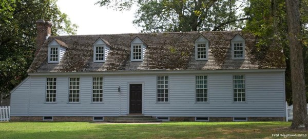
 When a house in Colonial Williamsburg is repainted, who picks the hues? It may come as a surprise but the house itself does! If it is an original building with original painted material, then the historic evidence should be there. It is my job to find those nooks and crannies that contain early paints, and analyze that evidence in the Materials Analysis Laboratory.
We’re interested in learning not just about color, but pigment and binding media composition, as well. Collaboration is always key for Colonial Williamsburg, and all architectural paint research projects are carried out with the help of the Archaeological and Architectural Research Department and the Department of Architectural Preservation.
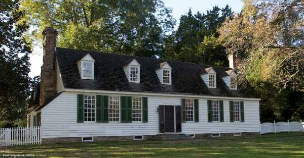 The Benjamin Waller House is an example of a paint research project that has resulted in a recent color change. This house is located at the east end of the Historic Area, at the corner of Francis and Waller streets. Up until last week, it was painted white with dark green shutters and dark brown doors. These colors were “discovered” during the 1951-53 restoration of the house, using rudimentary “scrape tests.” (This is an outdated technique that often missed key paint layers. It has been superseded by modern cross-section microscopy). An exact date for the construction is not known, but CW architectural historians believe the earliest section of the house is the east end, which was probably built around 1749-50. Multiple structural improvements and enlargements were made throughout the next few decades, including a rear wing and cellar entrance that were added sometime before 1782, when it was drawn on the Frenchman’s Map.
When the northeast cellar entrance was constructed in the late 18th century, this structure “captured” some original exterior painted weatherboards. These painted weatherboards are like a time capsule, protecting the exterior paint colors that date from 1749-50 to before 1782. Thirty years of paint colors, protected from the elements! This is a gold mine for architectural paint analysts like myself.
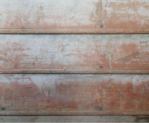
Captured weatherboards at the Benjamin Waller House (Photo Courtesy: Natasha Leoblich, 2008)
In 2008, the weatherboards were analyzed by Natasha Loeblich, CW’s architectural paint analyst at the time, using microscopic techniques almost identical to those currently in our lab. Using cross-section microscopy (described in a previous blog post), Natasha discovered three paints on the weatherboards: a red-brown paint (1), a yellow-brown paint (2), and a gray paint (3).
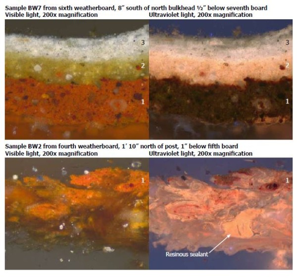
Loeblich, N. 2008. Cross-section microscopy analysis of exterior paints: Benjamin Waller House; Williamsburg, Virginia. Unpublished report for the Colonial Williamsburg Foundation, page 3.
Using Natasha’s report, we determined that the color of the house during the Revolutionary period (1770s) was most likely the more recent gray paint. Analysis determined that this paint was made with pigments common to the 18th century such as lead white, soot black, and chalk (usually added as a paint extender).
But what of the rest of the house? What colors were contemporary with the gray weatherboards in the late 18th century? As luck would have it, it recently came to light that the north front door is original, so I ran over to collect several samples to hopefully gain insight about the trim colors. Sure enough, cross-section microscopy determined that there were original paint layers on the door! Most importantly, the third generation was black. This would align with the gray on the weatherboards.
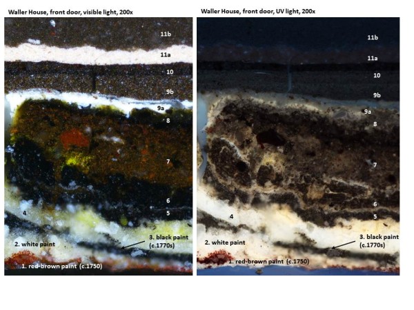
Cross-section of paint sample from Waller House front door, examined at 200x magnification with a Nikon NiU epi-flourescence microscope. The modern paints are not all shown in their entirety.
I analyzed the pigments with our polarizing light microscope to determine that the black paint was a mixture of mostly a carbon-based black (like soot black), a little lead white, and some chalk. You’ll note that these pigments are very similar to what was found in the contemporary gray paint!
In my lab, I used the colorimeter/microscope to measure the original gray and black paints in the samples Natasha and I had collected. CW’s colorimeter provides numerical values in what is called the CIE L*a*b* colorspace; L* values are for black to white, a* values for red to green, and b* values for blue to yellow. These numbers can be used to calculate the closest commercial match for replication.
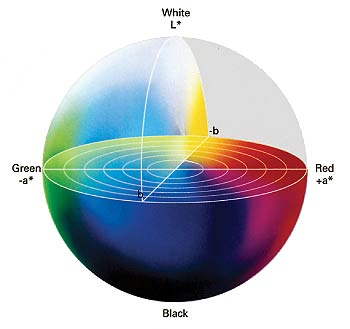
Graphic depiction of the CIE L*a*b* colorspace
The black paint was measured as L* (23.72), a* (+1.26) , b*(+3.19). The closest commercial match to this paint color was Benjamin Moore/Williamsburg #680 “Mopboard Black”.
The gray paint had to be matched by eye, because dirt particles embedded in the paint made it impossible for the colorimeter to accurately measure the color. The closest commercial match for this paint was Benjamin Moore/Williamsburg #700 “Slate.”
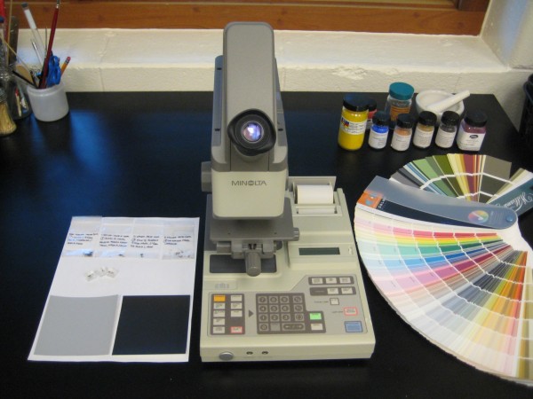
The Minolta Microscope/Colorimeter in the lab can accurately measure colors from fragments as small as 0.3 mm. The paint samples and color matches for the Waller House are seen to the left of the colorimeter.
Interestingly, this gray and black paint scheme is consistent with other Williamsburg neighbors, notably the William Finnie House a few doors down, and the Robert Carter House on Palace Green. Like it or not, gray and black house paint schemes appear to have been fashionable in Revolutionary-era Williamsburg.
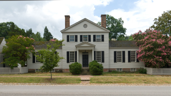
William Finnie House - Photo Courtesy: Jeff Klee, Architectural Historian
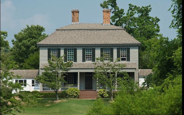
Robert Carter House, with gray and black exterior color scheme identified through recent paint analysis
As you can see, modern methods of analysis get us ever closer to presenting the historic area as it appeared in the American Revolution, but the social, economic, and maybe even political stories behind these paint schemes are certainly the subject of further study!
Blogger: Kirsten Moffitt
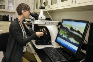 Kirsten received her M.S. from the Winterthur/University of Delaware Program in Art Conservation, where she specialized in the conservation and analysis of painted surfaces. As Colonial Williamsburg’s Materials Analyst and Associate Conservator, Kirsten analyzes all types of collection materials including metals, ceramics, textiles, furniture and house paints in the Foundation’s newly established Materials Analysis Laboratory. She loves that her job is a combination of art history, chemistry, and forensics. Kirsten truly loves watching paint dry, and her analytical work was a big contribution to Benjamin Moore’s Williamsburg Collection line.
Kirsten loves reading, traveling, and walking her black lab, Ebbie, around the Historic Area.



Joan says
The paint story is very interesting The research now possible is most impressive. I rather like the new colors - even the all one color look
. I find it difficult to identify the exact color used on the houses. There are so many tones of each color. Could you give me the Benjamin Moore/Williamsburg paint number for the Thomas Everard house yellow, the Davenport House red and is the Peyton Randolph house red. the same color of red?. Also, could use the number on the Carter house gray. with the numbers I can go to Benjamin Moore and look at the chips and get paint samples.
Thank you for all the good work.
lars says
Looks like your Lab colorspace figure shows -b* being yellow. Im pretty sure a positive b* is yellow.
Reference: Everything about CIELAB online.
Hi Lars! You are totally right and I should have caught that before I posted. Thanks!
Hello Kirsten,
I have just purchase an early nineteenth century wood clapboard house in Upstate New York, and I am very interested in painting it black - single color, no trim. I have been looking at a color by Farrow & Ball called Off Black as an option, but I’m curious… would you be able to recommend any commercially available black paint colors that you would find to be good examples of historically accurate black paint used on exteriors? I’ve seen a few Colonial homes that were black, or almost black, like the one attached, and would love any advice you are willing to share. Thank you!!
I loved your work & the good part is i really enjoyed reading about the Benjamin Waller House, which i think is a example of perfect art plus hard work. you have done a good work here, thanks for sharing
Why were the shutters not reinstalled on the Waller House? Were they not there? If they were, is it known what color they were painted?
Hi Todd, thanks for your question! The shutters have been removed from the Waller house so they can be painted off-site. They will be re-installed at the end of the project. We don’t know what the shutter colors were on the house. Shutters are tricky, as there are so few 18th-century examples that survive. What we do know about shutter colors is often gleaned from historic treatises as well as paintings and prints from the time period. Hope this helps!
I found this very interesting and impressive. An important influence in my wife’s and my initial introduction and infatuation with Colonial Williamsburg came out of color analyses. I am a senior chemist in a company that makes silica matting agents for the paints and coatings industry, silicas as pharmaceutical excipients, and silicas used in toothpaste as an abrasive, along with other applications.
I oversee color analyses of these products and attended a seminar on that at a hotel in the Williamsburg area. As part of the seminar, to keep our interest up I think, there was a hour long segment presented by Dr. Susan Buck who has done a lot of the type of paint investigations you describe in this blog. I had asked my wife to go along with me on this business trip and finding this presentation so interesting we spent our free time wandering the streets of the historic area. We began visiting Colonial Williamsburg every year, and have been annual pass holders. We spent seven days there in May, and have another seven day vacation there in November.
I am very interested in early American history. What I see and experience in the historic area helps put into context what I read. It makes me feel a lot better about my experiences to see how much work goes into “getting it right”, even if it means changing the look of a building from time to time, or reinterpreting an event or our understanding of an historic character.
Thanks for your work. Looks very well done and thorough to me.
Dear Jeffrey,
Thanks so much for your interest in our work! Dr. Buck is my mentor and good friend, and she will be pleased to hear (as I am), that paint analysis is one of the many things that draws you and your wife to the historic area time and time again!
With much appreciation,
Kirsten Moffitt